
Many people have asked me to talk about the A4 Reports that I have introduced on one of our projects. I’ve postponed this for a look time, but I finally got around to do it.
The idea came from the book Toyota Way, by Jeffrey Liker. At the beginning of the book, the author warns the reader against a classic trap: after reading about the success met by Toyota, many want to implement their practices verbatim. Well, my philosophy is that, if I got only one useful practice from the book, then it was worth paying for ;-)
So anyway, the author is telling about the fact that Toyota employees do “A3 Reports”. The idea is that, when there is a problem, after careful thinking, the people in charge produce a report that fit on an A3 page. The reason for this constraint is that 1) is it quick to read, 2) it can be faxed around the company with the fax machines they have.
Another thing is that they tell about the problem and the solution using Plan-Do-Check-Act (PDCA). Which means that their reports typically contain:
- a description of the problem
- an overview of the possible solutions, including options that were later discarded
- a description of the implementation of the solution on a limited scale (Plan & Do)
- a description of what needs to be monitored, and milestones (Check)
- if the solution is proving a success, a description of the implementation company-wide (Act)
I was personally attracted to the reports, because they force the writer to keep the information concise, though readable. Graphs were good too, as long as they make the contents clearer to the reader.
My personal problem was that, as a ScrumMaster, I have to produce reports every time we complete an iteration. The reports are boring to write, probably boring to read, and they were getting longer as the various stakeholders regularly demanded that I add more information. Other metrics that had to be maintained included productivity, progress on project, etc. I felt that these metrics were not very useful and I had also been getting into arguments with my boss’ boss, especially after a steering committee where it had become clear that I couldn’t make the situation easily understandable to our clients, even with an Excel document containing 6 sheets. So I was feeling some pressure to show goodwill, and to produce something that was actually useful.
One day, my direct boss demanded that I produce not only my usual textual report (generally 2-page long), but also a 10-slide PowerPoint presentation. I was underwhelmed, since I already felt my report was not that useful. I got her, though, to agree that, in addition to what she wanted, it’d be worth trying those shorter reports.
I set myself the following constraints:
- must fit on a single A4 sheet, as this was the only format of paper supported by our printers
- character size must stay at 12 points for normal text; text that was part of graphs just had to be “as readable as I could make it”
The result for the first Sprint to have an A4 report is the following (in French):
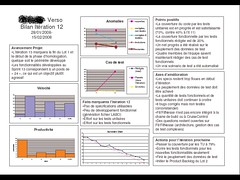
Things of note:
- the 3 columns; they are the key to fit as much text as possible when you have many bullet points
- the charts, especially the burndown chart. This was the first time I managed to show the burndown chart in a readable fashion in a report to people external to the team.
- the content, which is made largely by the information gathered during the iteration retrospective
When my boss saw this report, she was delighted. It became the main document discussed during steering committees between the various stakeholders, including the CEO of the company. I also sticked it to the walls of the development room, in full colors.
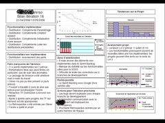
In later iterations, I refined the report a bit, but it stayed largely the same. For a few iterations, I had a tendency to change the charts, depending on the situation (for example, if speed of development was an issue, I’d add a chart showing the number of actual work days per iteration). I have found that it was not as necessary in later iterations. Probably a good thing, as I would not be able to gather all the data necessary.
Here is how it looked in a recent iteration (in French again, so it might be hard to figure out what each box is for):
How I build the report:
- The report is built using Excel. Some charts come from external sources, such as the burndown chart which I extract from the Google Spreadsheet-based Sprint Backlog; an issue is that, being images, they are hard to redimension. Other charts come from separate Excel files, which is a bit annoying as Excel suggests pulling data from the other Excel files every time I open the report. Finally, some charts are made from data that are hard-coded in the same Excel file, such as velocity and code coverage.
- A lot of information is actually coming from the Sprint Retrospective. I can prepare a few things before the retrospective (mostly the charts) but much of the data is mined from what was learned during the retropective.
- I spend quite some time adjusting the boxes on the sheet. The best way I’ve found is to use drawing features from Excel that let you perfectly align or center elements together. Still, it takes significant time to clean up at the end.
For your information, here is a list of the noxes used in the last report. You will want to adapt this to your needs:
- Sprint Number & Dates
- Implemented Features
- Features that Were Not Implemented
- Important Facts from the Sprint
- Burndown Chart; this is now coming from a Google Spreadsheet ;-)
- Statistics on bugs
- Things We Could Improve Upon
- Things We Are Happy About
- Actions For Next Sprint
- Project Trends
- Velocity
- Overall Progress on Project
- Overall Bug Statistics
- Code Coverage By Tests
I hope all this will help. Let me know your improvements on my design!

Your report looks very good.
It just seems a little bit too technical for a steering committee. I can’t see any financial data either.
I used to have the same problem. Reporting is a necessary but boring task. I’ve decided to develop a project management tool that does almost all the reporting work automatically and in real time. It is quite complementary with your report as it is based on the earned value management technique and so cost/delay oriented.
You can have a look at the following URL [http://www.timeperformance.com]. The site is in French. The English version should come shortly. I’d be glad to have your feedback.
Congratulations for your blog. It contains very good quality posts.
Merci Eric,
J’avais aperçu ces synthèses lors d’une formation Scrum en mars et j’avais été un peu frustré à vrai dire de ne pas en avoir eu une copie. Bon, je ne l’avais pas demandé en même temps…
Jean-François
@Jean-François: je crois qu’à l’époque, je n’en avais qu’un seul exemplaire sur moi (c’était les débuts et je n’avais pas prévu à l’origine d’en parler dans la formation Scrum).
Maintenant, j’ai toujours plusieurs copies sur moi pour en distribuer.